The first screen states the promise, audience, and tone without making people work.
Copy sounds written for this firm, not dropped into a theme.
Offers, tools, and next steps sit in the right places so the site feels dependable.
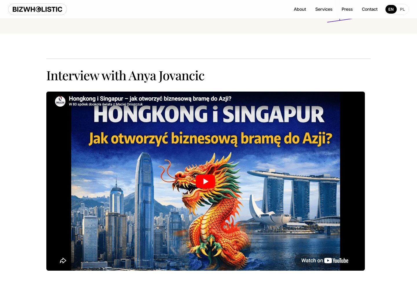
Press material gets its own polished page, with spacing and hierarchy that respect the source.
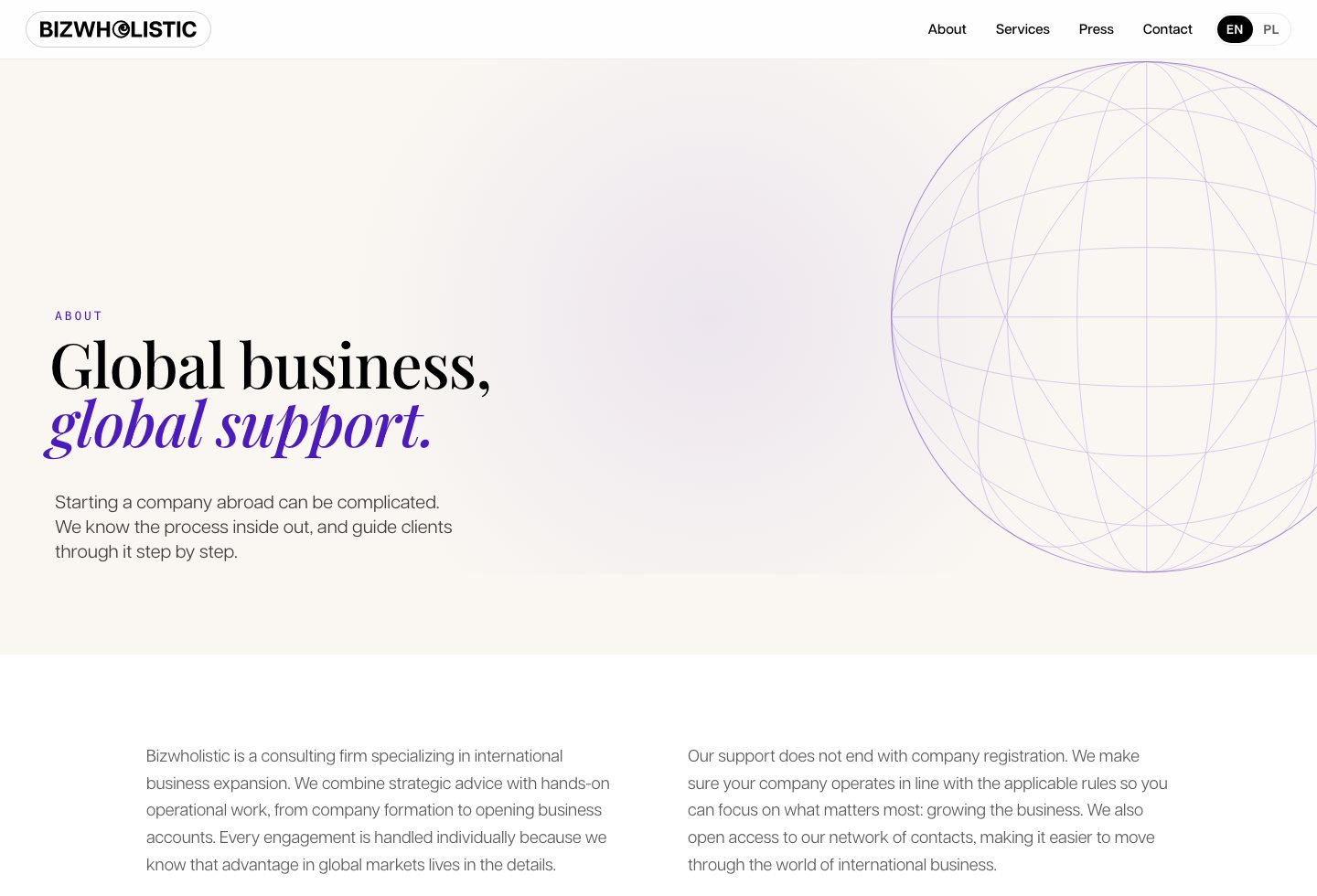
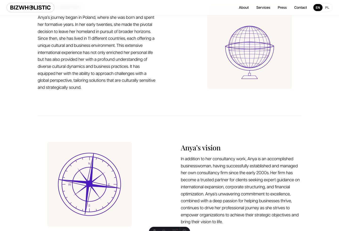
Custom globe and compass line art make the About page feel drawn for the brand.
The same message stays sharp, readable, and composed on narrow screens.